
When a Color Palette Becomes a Playbook
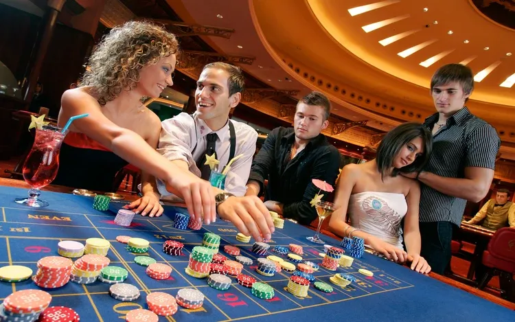
Open any modern slots lobby and your eyes will do the choosing before your mind catches up. Reds buzz, golds promise, blues soothe, purples whisper “mystery,” and neons shout “now.” Long before reels spin, a carefully engineered palette has already nudged your heart rate, attention, and expectations. This is not an accident – it’s design with a theory behind it. Whether you’re browsing new titles or returning to favorites you first noticed while exploring 5Gringos 5, the colors you see do emotional work: organizing choices, shaping anticipation, and – yes – subtly influencing how long you stay. This article goes far beyond “red is exciting” clichés. We’ll unpack the visual neuroscience, cultural semiotics, UX patterns, and ethical guardrails behind casino color – and we’ll arm you with tools to keep your nights bright, not blurry.
The Case for Color: Why It Matters Before the First Spin
Color is the first and fastest layer of visual meaning your brain processes. Within about 100–200 milliseconds, preconscious pathways have:
- Ranked salience (what deserves attention first)
- Set affective tone (alert, calm, curious)
- Prepared motor plans (hover, click, swipe)
Color, in other words, turns a casino screen into a landscape of guided impulses. When palettes are intentional, players experience lower friction, clearer choices, and momentum. When palettes are manipulative, players experience arousal without awareness. Understanding the line between the two is the point of this guide.
A Quick Primer: How the Brain and Eyes Parse Color
- Three cones, endless stories.
Your retina houses S, M, and L cones (short/medium/long wavelengths). The brain combines their outputs into opponent channels (red–green, blue–yellow) and a luminance channel (light–dark). - Arousal rides luminance and contrast.
High brightness and sharp contrast wake the system faster than subtle hue shifts. This is why bold highlights on dark UIs feel “urgent.” - Hue sets mood; saturation sets intensity.
Red versus blue can tilt you toward approach or calm; saturation dials how loudly that mood speaks.
Knowing this, slot and lobby designers orchestrate hue (feeling) + saturation (volume) + luminance (urgency) to sculpt your journey.
Hue by Hue: What Common Casino Colors Tend to Do
None of these mappings are absolute; they’re probabilities shaped by biology and culture. Still, they’re reliable enough to be used deliberately in casino design.
- Red – Urgency, approach, high arousal
Often attached to “spin,” “max bet,” or “re-spin” CTAs; also used for countdowns and limited-time offers. Small hits of red increase click-likelihood; overuse can create fatigue or perceived aggression. - Gold – Reward, premium, “it paid”
Fills, glows, and confetti bursts in gold signal gain states. Paired with metallic gradients, gold stamps a memory of “value” even for modest wins. - Green – Safety, “go,” balance health
Common in cash-out buttons, “OK” confirmations, and wallet health indicators. Soft greens say “you’re fine here”; neon greens say “accelerate.” - Blue – Calm, trust, time dilation
Midnight or desaturated blues are perfect for night modes. They reduce visual strain and create a contemplative feeling that lengthens sessions – pleasantly if bounded, problematically if not. - Purple – Mystery, VIP, transport
Frequently used for bonus portals, new worlds, and special events. With slight magenta shifts, it reads as “enchanted” rather than corporate. - Orange – Energy, social fun
Invites to tournaments and community events. It’s joyful, less intense than red, and good for “play together” moments. - Black / Charcoal – Stagecraft, contrast, luxury
A dark stage makes saturated colors feel brighter and wins feel punchier. It also hides time; without bright surrounding UI, the screen becomes the night.
Saturation & Luminance: The Volume Knobs of Emotion
- High saturation grabs attention but can shorten patience if everything shouts.
- Low saturation creates elegance and endurance but risks feeling flat if never punctuated.
- High luminance (bright elements) on dark backgrounds creates that beloved “neon pop,” perfect for wins and actionable buttons.
- Low luminance (dim or matte elements) increases dwell time and makes the experience feel slower and safer.
Expert design plays these knobs like a mixer: quiet canvases, bright beats.
Contrast Is a Compass: Directing Eyes and Decisions
Your visual system is a contrast detector. Designers use contrast to:
- Point: Make primary CTAs brighter or warmer than everything else.
- Pace: Dim the interface between spins to create recovery time.
- Partition: Give menus low contrast so reels stay focal, then reverse it in lobbies to help selection over action.
If you feel “guided,” that’s good design. If you feel “pushed,” that’s design without restraint.
Motion + Color: The Accelerator (and When to Tap the Brakes)
Color rarely works alone. Pulsing, shimmer, particle glows, and color cycling exploit the brain’s motion detectors to spike arousal:
- Pulsing red/orange on re-spin banners increases click rates.
- Slow golden shimmer during a win extends savor time, improving memory of the event.
- Rainbow cycles can fatigue quickly; best used as brief “sparkles,” not constant loops.
Healthy design respects habituation (we acclimate quickly) and keeps motion special.
Pre-Result Palettes: Painting Anticipation
Great slots use “anticipatory palettes”:
- Neutral baseline (blues/charcoals) during idle.
- Warm ramp (ambers/reds) as reels slow into a near-miss.
- Cool flash-to-warm (blue → gold) on actual win to separate almost from yes.
This sequencing helps your memory file events cleanly – if near-miss warmth is restrained. Over-coloring near-misses risks turning losses into addictive “maybes.”
Near-Miss Color: The Fine Line Between Theatre and Manipulation
A near-miss is mathematically a loss. If it’s lit like a victory (warm hues, celebratory sparkles), the brain marks it as closer than it was. Ethical design:
- Keeps near-miss cues distinct from win cues.
- Uses short, cooler accents for near-miss, reserving warm, longer glows for true wins.
- Adds micro-pauses after near-misses to let players reset (and possibly stop).
You can spot integrity on the screen.
Cultural Color: Same Rainbow, Different Meanings
- Red: lucky in East Asian contexts; danger/stop in many Western ones.
- White: purity in some cultures, mourning in others.
- Purple: royalty historically in Europe; spirituality elsewhere.
Global casinos test palettes regionally. Players should remember that some reactions are learned, not innate.
Accessibility: Designing Beyond a Single Vision
About 8% of men and 0.5% of women have some color-vision deficiency. Responsible slot design:
- Pairs color with shape/iconography so a red “cancel” is also an X, and green “confirm” is also a ✓.
- Avoids red/green dependency in critical states; uses luminance and patterns too.
- Offers an accessibility toggle (higher contrast, reduced motion, alternative palettes).
If a game feels instantly clear even with your screen dimmed or in grayscale, it’s probably accessible by design.
Cross-Modal Harmony: Color, Sound, and Haptics
The brain loves correspondences:
- Warm color + major chords + ascending arpeggios read as gain and “openness.”
- Cool color + minor/neutral tones read as neutrality or reset.
- Haptics (subtle taps) timed with color shifts increase certainty and reduce anxiety.
When these channels align, play feels coherent rather than noisy.
Night Mode: Blue Light, Dark UIs, and Time Drift
Dark palettes reduce glare and eye strain at night, but they also dissolve the room around you. That immersion is delightful – and risky for time awareness. Good night modes include:
- Readable clocks (yes, really)
- Soft reality checks (“You planned 45 minutes; you’re at 40”)
- Warmer whites (less blue) to avoid circadian disruption
Design should help you remember the world you’ll return to when you press “close.”
Ethical Color: Guardrails That Respect Players
A platform that cares about longevity – not extraction – uses color to:
- Clarify (what’s actionable, what’s happened), not to confuse.
- Celebrate proportionally (big color for big wins; modest color for small), not to inflate.
- Invite breaks (cooling palettes, visible “pause/withdraw”) after intense moments.
- Show value honestly (credits and currency) to reduce “phantom money.”
The test: can you say “no” as easily as “go”? If yes, color is doing its job.
Player Playbook: How to “See Through” Color Without Losing the Fun
- Use dual displays. Pin both credits and your currency; color has less room to create distance.
- Watch for near-miss theatrics. If a loss is glowing warm, say out loud: “Loss, not signal.”
- Add micro-pauses. After any warm blast (bonus, near-miss), look away from the screen for two seconds; let your internal color settle.
- Customize brightness. Lowering saturation and backlight turns shouting into speaking.
- Switch themes. If a title’s palette keeps you too amped, pick calmer art – no shame in preferring blues and greens over constant reds.
- Schedule exits. Choose an “ending color” (e.g., first screen that shows a neutral blue summary → withdraw). Your brain will learn the cue.
Do-It-Yourself Micro-Experiments (Fast and Revealing)
- Grayscale test (1 minute):
Turn on grayscale (phone accessibility). Does the game still feel compelling? You’ll learn how much the palette carries your engagement. - Clock anchoring (one session):
Place a small analog clock within your peripheral vision. Do warm win palettes eclipse it? That tells you how immersive the color is. - Palette swap (two sessions):
Play a high-saturation warm game one night and a cooler, desaturated one the next with the same budget/time. Compare time drift and exit satisfaction. - Near-miss naming (ten events):
Each time you feel “almost,” whisper “loss.” Notice how quickly your urge to press “again” becomes deliberate rather than automatic.
Case Vignettes (Composite, Realistic)
- Noah, 33, developer:
Loves cyber-neon slots with intense magenta/cyan combos. He finds himself overstimulated and chasing. Fix: lowers saturation, switches to calmer palettes on work nights, and uses an “exit on first gold confetti” rule. - Mina, 41, nurse:
Night mode + muted blues help her unwind after late shifts. She uses a 45-minute time box and prefers games where near-misses are visually restrained. Result: higher enjoyment, less “just one more.” - Lea, 28, designer:
Realized wins didn’t land because every small event had the same orange flash. She now picks titles with modest micro-wins and kick-drum celebrations for big ones. Wins feel bigger because the UI gives them room.
The Most Common Myths About Color in Casinos
- “Red makes you lose control.”
Red raises arousal; it doesn’t erase agency. Pair high-energy palettes with clear personal rules. - “Blue games are safer.”
Blue can be soothing enough to lengthen sessions. Safe = your limits, not the hue. - “A brighter lobby means better payouts.”
Brightness is an attention strategy, not a math change. RTP lives in rules, not palettes. - “If near-misses look like wins, odds are better.”
Nope – those are theater choices. Inspect paytables; trust numbers, not sparkles.
For Designers and Product Teams: A Brief Ethical Checklist
- Hierarchy: One primary action color at a time; let others relax.
- Proportion: Reserve warm, saturated hues and long animations for significant events.
- Reset moments: Cool the screen (color and motion) after intense states.
- Honesty: Near-miss isn’t win – keep palettes distinct.
- Accessibility: Alternative palettes, higher-contrast options, pattern cues.
- Autonomy cues: “Pause,” “Withdraw,” and “Set limit” should be visible and welcoming, not hidden.
Craft for memory, not trance.
Why Color Shapes Time (and Why That Matters)
Color doesn’t just set moods; it structures time. Warm bursts function as timestamps; cool baselines function as rests between acts. When everything is warm, time becomes a blur. When warmth is rare, time becomes a story. For players, this distinction is everything: stories end well; blurs do not.
The Philosophy of Palettes: Freedom as Framing
You don’t control outcomes, but you do control context – budget, time, and the atmosphere you play in. Picking palettes that match your intent (calm exploration vs. high-energy bursts) is a form of authorship. The most satisfying sessions are the ones where color supported your plan rather than hijacked it.
Quick FAQ
Does color change RTP?
No. Color can change how you feel but not the math.
Should I avoid warm palettes entirely?
Not at all. Use them like spice: in bursts, with boundaries.
How do I know if a game overuses near-miss color?
If losses glow like wins, and you feel a reflex urge to immediately re-spin, the palette is probably conflating states.
Is grayscale the ultimate fix?
It’s a great audit tool, but you might miss the artistry. Better to tune brightness and choose palettes that respect your boundaries.
Responsible Play, Always
Color can enhance fun, but it should never obscure your limits. If you notice secrecy, chasing, or sessions that repeatedly outlast your plan, consider lower limits, cooling-off periods, or support resources available in your region. The best color in any casino is the one you see on your withdrawal confirmation when you decide the night is complete.
Conclusion – Seeing the Spectrum Clearly
Color is casino language. It’s how games set tempo, assign meaning, and escort you from idle to engaged, from curiosity to climax. In skillful hands, palettes reduce friction and make wins feel properly special. In careless hands, they flatten memory and stretch time until hours slip away. Now you know what’s happening under the hood: the cones and channels, the warm and cool dramaturgy, the ethics of near-miss glow, the power of contrast, and the quiet authority of your own settings.
Use that knowledge to play in full color – eyes open, story priced, exit intact. Let warmth be a highlight, not a default. Let cool be a breath, not a blur. And let your choices – not a palette – decide how bright the night becomes.